It’s Transformation Tuesday, a new feature on the blog! Every Tuesday I’ll showcase a website or product and how I might use UX research and design to make improvements.
This week I’m featuring a redesign mockup and research plan I presented to the MSU Food Literacy and Engagement Poll group a few months ago. This redesign plan centered on refreshing their webpage to 1) increase downloads and use of their poll results and 2) make information about the poll more transparent to users. Unfortunately, due to some role changes, this group needs significant time before working on their web presence, so this project stayed in the concept staged. As a disclaimer, I receive funding from AgBioResearch and have for several years.
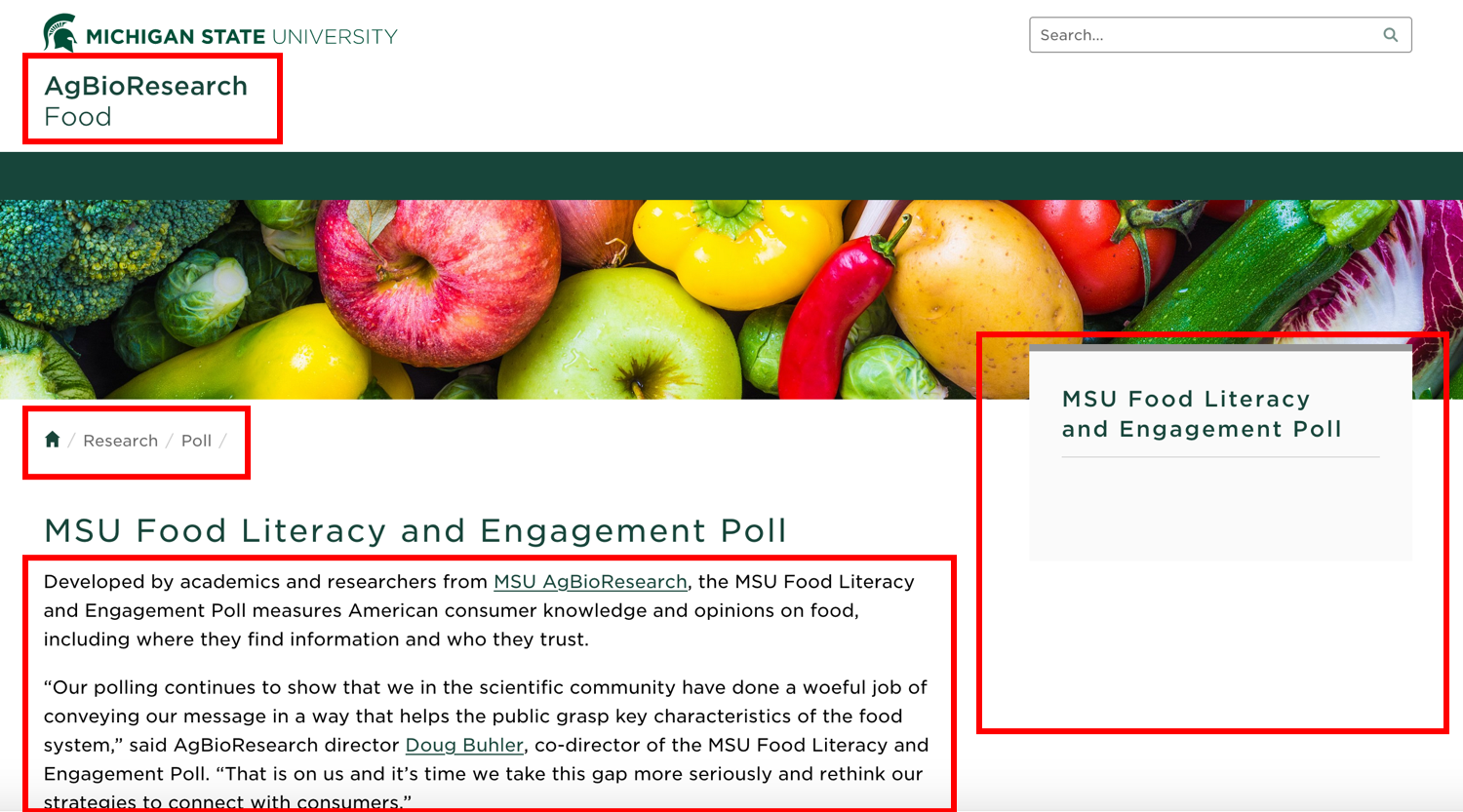
First, let’s take a quick look at the the landing page for the MSU Food Literacy and Engagement Poll Right away. While I know that the poll is interesting and yields important information, it’s hard to know where one would go to access information about the poll or poll results from this landing page.
Right away, there are several areas for improvement, as highlighted by the red boxes. The navigation indicated by “AgBioResearch/Food” doesn’t match “Home/Research/Poll.” The righthand side nav box is empty. Finally, the copy below the title has a good first sentence, but the the subsequent content could be moved elsewhere and some additional explanation content could be added.
Assuming this is a project with a two-month time frame (short for academia) with a minimal budget, my hypothetical plan for a simple refresh for this page to increase its functionality and usability would be as follows:
1) Conduct User Interviews: Structured, virtual interviews with members of poll team, previous poll data users, individuals who have written about the poll. Interview questions would focus on why and how users have interacted with the page, what their pain points are, and suggestions for improvement. The sample size for this would depend on project budget and how many users it took to reach saturation for findings. I’d take info from these interviews, synthesize them into top three findings, and use these findings to drive changes to the current design.
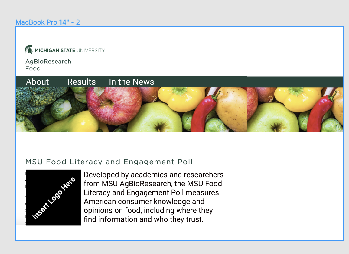
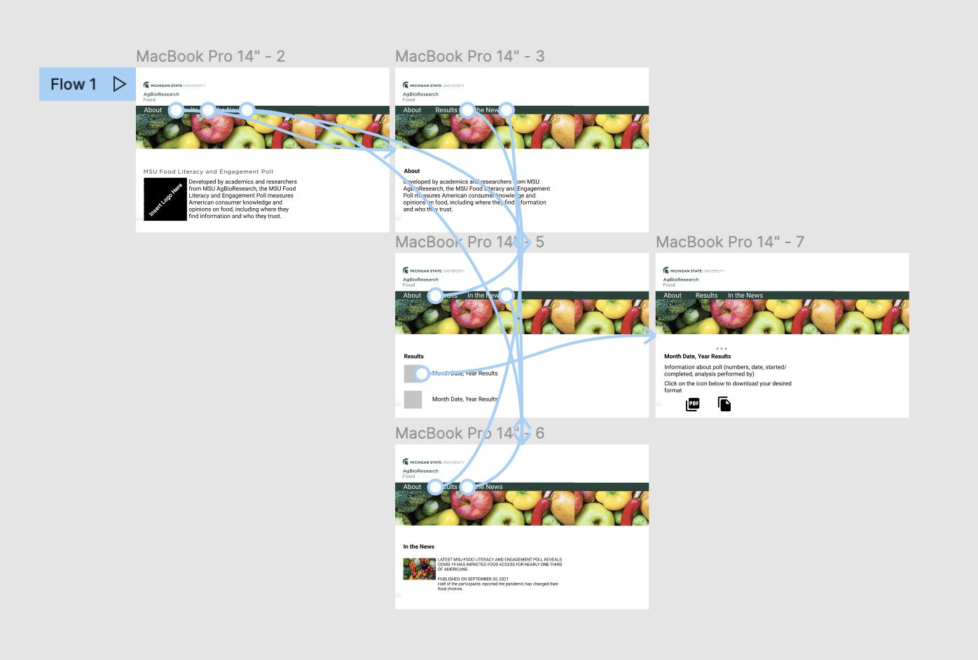
2) Create Design Prototype: Use feedback from interviews to create a prototype new site in Figma. This might look like the image below. Some items I image might be needed based on my own analysis of the site: easily digestible information on how the poll was conducted, link to a page where different years of poll results could be downloaded, and a page of how poll data has been used. I’d create some additional pages for these items and design an information architecture and flow that made sense for users.
3) Usability Testing Round 1: Virtual moderated usability testing using Design Iteration #1 to test if individuals can access info about the poll, poll results, and contact info for the poll. Again, the sample size for this would depend on project budget and how many users it took to reach saturation for findings. Results from this would drive the design of the new website.
4) Create new website: Use results from usability testing and design prototype to edit existing website.
5) Monitor site analytics to understand user journeys on this website. I’d also compare pre-transformation pick up of poll results and downloads of poll data to post-transformation of these counts.
6) Create 1-page research and progress brief for stakeholders: I would create a 1-page document for the stakeholder group outlining the challenge, the research methods and results, and the potential future opportunities. Results from the user interviews and usability studies would be presented visually.
Final note: With an expanded budget and timeline, I’d run multiple rounds of design iterations and usability testing, as well as introduce an open card sort to make sure i am capturing all of the categories those who conduct and use the poll need. I would also, after a few months, run a focus group of individuals who have used the poll to understand their impressions and feelings about the new site.


